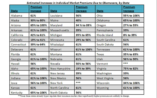
A Simple Chart From The Heritage Foundation Posted on March 19, 2013 by granny g This chart is part of a longer article about the cost of Obamacare posted at Heritage.org: Repeal and replace!